Writing as Designing: Integrating Infographics in Composition
Eric Cody Smothers, Miami University
Abstract
Infographics are used in academic, professional and even non-academic settings for a variety of purposes and are valuable tools for spreading knowledge and understanding about research topics. Infographics also represent a unique way of composing visually by being attentive to the importance of titles, concise information, and the striking visual layout of images, graphics, icons and design elements for an audience. Instructors should learn these platforms and be equipped with scholarship, direction and resources in order to aid, assess, and evaluate student infographic products. This study looks at the importance of data visualization and information design using a qualitative research study involving students in an advanced writing course composing with infographics. The data results show students who compose with infographics gain a more metacognitive perspective of design choices which impacts an audience. The results demonstrate that students also develop crucial professional presentation practices and gain valuable research, graphic design, and marketing skills. Finally, the results from this study culminate in a useful infographic heuristic model for instructors, designers and students to use when reflecting on their visual composing choices.
Keywords: Infographics, Visual rhetoric, Visual pedagogy, Data visualization, Information design, New media, Modes.
Introduction
“...I learned that sometimes you are only given so much space to work with, so pictures and icons can speak louder than the actual words on the infographic, so that’s why it is important to me to find icons that match research and facts that I wanted to present.” -Emily Kahn
“Infographics are really a great way to transmit our knowledge, what we know to other people; a great way to bring all the knowledge that we know together… so it’s working with the pictures and the effect they have.” - Tin Bui
“You know, there’s the evidence-based learning style, and summarizing is one of the styles there and a proven way to learn different information for students and it's really helpful for honing in on a topic and learning about it.” - Olivia Branson
Visuals are all around us. We see them on our commute to work. Images always flood our computers, whether through websites, social media, or search engines. There are many ways in which creating and using visuals is at the forefront not only of academic environments but also in professional contexts. Pictures and icons in fact “can'' speak louder than words especially within informative and argumentative based research. This is a research study which seeks to demonstrate the intersection between the research writing process and visual information design. One platform which allows for this process between research writing and information design is infographics. In more familiar territory, they often are used in flyers, posters, and advertisements you may see from groceries and doctor’s offices to classrooms of all disciplines. The value of composing such multimodal products is highly valuable today for instruction. According to Lauer (2013) instructors who utilize multimodal and visual pedagogies such as multimodal projects provide students with benefits in technical and professional fields because such strategies embrace “visual literacy, visual rhetoric, and graphic design” in order to construct diverse contexts and meanings (p.172). Infographic platforms can transform writers into designers, students into makers, and ultimately the instructor into a dynamic and fluid practitioner of innovative multimodal learning strategies to help all.
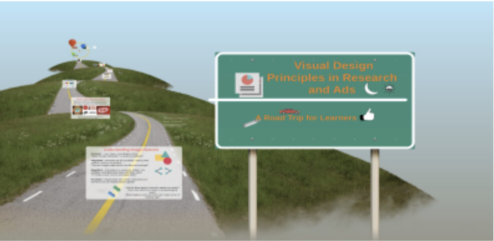
This is a study which provides context to students who are asked to compose visually with infographics connected to research. Thus, it is important instructors gain valuable insight into student visual writing processes. The emergence of these new modes of composing and thinking about writing has the ability to change what we know about the writing process by showing how genres of writing can be restructured within digital environments (Graham and Whalen, 2008; MAP, 2013). I am a graduate instructor who teaches first-year and second-year generalist composition courses in Miami’s composition program which are open to any student in the university (specialized technical and professional writing classes are also available). Due to the student population, I often teach students who are not as familiar with multimodal practices in writing and because of this I often embrace new ways of designing assignments, framing the experience from the perspective of a journey itself (see Fig.1). In creating highly visual and interactive ways of exploring class content, I find that students are better prepared for actually understanding the importance of multimodality, visual design, and representing their research through the use of infographics. So why not feel that the process of writing transformation can be a journey? The purpose of this study as well as the findings and resources here can better help instructors and students understand the argumentative potential among new modalities of composing. Creating infographics especially shows considerable promise to students thinking in metacognitive and innovative ways about their writing.
 |
|
Fig. 1: “Visual design principles in research and ads: A road trip for learners” (Links to outside resource found in Appendices)
|
Visual composing with infographics has transformed what we know about writing. In this article I first position my study within the scholarship of infographic (multimodal) design by providing context of what we know about how students compose in online digital platforms. I specifically will explore these questions:
- What are the visual design processes composition students undertake when making infographic arguments?
- How can we provide better tools and instruction for students composing infographics for research, presentation, professional, or marketing purposes?
- Given the students’ experiences, what can instructors do to have better pedagogy in the classroom related to teaching about infographics and information design?
These are important questions that I will address and analyze more fully in the following sections starting with a review of important scholarship. In the methods section I will outline the procedures, recruitment tools, and artifacts used in order to make this study possible. I will analyze actual student responses and infographic products related to a generalist advanced writing course. Many of the results will show students possess an attention towards conciseness, icon usage, platform accessibility, and infographic applications. Lastly, I will synthesize my findings for a usable heuristic model for thinking about working with infographics.
Infographics and Data Visualization: A Literature Review
Infographics are valuable digital tools and how a designer takes their findings, research, and experiences and translates them into visuals is a unique process. For example, Sorapure (2019), focusses on an immersive, narrative based platform called Dollar Street, where visitors experience a visual representation of people’s lives by underlining the interaction between text, images, and graphics. This idea of information visualization (infovis) here is that “infovis is an increasingly rich and relevant object of study for writing researchers and teachers who endeavor to help students gain proficiency with new digital literacies and practices” (Sorapure, 2019, p.1). Furthermore, this study reinforces among many things the importance of visual relationships where color, spacing, image/text representation or places draw our attention to emphasizing, bolding, or highlighting instances of typographic design (Sorapure, 2019, p.6). As in the case of both Sorapure (2019)’s Dollar Street and Graham and Whalen’s (2008) graphic design among builders of websites, goes back to how data visualizations are linked to professional contexts as well. As described in Mauldin’s text, data visualizations in the form of infographics which take numbers, images, and icons together are a great narrative by which many professional settings from library science, marketing, programming, and education can demonstrate the value of communicating information quickly among audiences (2015, p.8). There are many other ways in which data visualizations are enhanced through infographic platforms.
Many studies which demonstrate how infographics are used are also reflective of the many disciplines which students come from. The unique interdisciplinary nature of infographics can go beyond composition and graphic design instruction, but also demonstrate the visualization of mathematical principles in early education studies (Ozdamli and Ozdal, 2018) or how the public health and medical communities can make people more aware of factual data which can help people lead better lives (Wansink and Robbins, 2016). However, on a deeper level of study, infographics are concerned with not just data visualization but the cognitive process of helping information retention. According to a cognitive study by Majooni et al. (2018), “infographic presentation is necessary for attracting the attention of the viewer; to deliver abstract information; therefore, comprehension and retention are the key factors in the design of any infographic'' (p.258). Through these studies, infographic design has potential beyond the classroom to reach publics in medical, professional, business, and other communication-based fields and contexts.
Within each of the critical person-based studies on infographics represent important angles for understanding the power of presenting information and creating meaning. For example, in Marjooni et al. (2018) the investigation involved the use of an eye-tracking device to measure whether certain infographics reduced the “cognitive loads'' of the participants and the results ultimately showed how viewers of infographics are responsive to aspects of design layout, often returning and revisiting previous visual information based on the patterns of the visuals (p.264). The recording of how participants processed, viewed, and retained visual information also represents a unique glimpse into the quantitative side of infographic designs. In similar fashion, in Wansink and Robbins (2016), different focus groups were used to view and evaluate the efficiency of information presented in health-related infographics determining that the designs that scored higher among participants contained, “action-oriented titles or short titles, simple text, color, and humor” (p.781).
Strikingly, these studies show the mixed methods approach in gathering data and research about infographics. By establishing a specific model for working with infographics such as ADDIE (Analysis, Design, Development, Implementation and Evaluation) researchers are better able to provide not only students but instructors with diverse development practices for integrating these infographic practices in teaching (Ozdamli & Ozdal, 2017). Within each study on infographics and data visualization there is a concern of transferring knowledge and concepts to visual/digital platforms and implementing design practices in both students and instructors. The concept of visualization, digital composing and the products made, show a move in visual literacies that creates new meanings and reasons for further rhetorical investigation (MAP, 2013, p. 17). Students and instructors can use infographics as either design artifacts or presentation platforms in order to gain new experiences as designers.
Instructors, therefore, need to integrate pedagogical strategies for better visual instruction among students composing infographics. For instance, Lauer (2013) demonstrates a study involving an on-going, semester long project where visually engaged assignments were integrated into different stages of student work. Essentially, the instructor assigned poster projects concerned with rhetorical design choices of images, shapes, symbols, colors and typography, while a final brochure assignment culminated in “requiring students to apply design and rhetorical principles while managing greater amounts of visual and verbal information than typically used in a poster” (Lauer, 2013, p.176). Infographic assignments on a similar level have far-reaching potential in both academic and professional contexts especially in how students establish professional presence in online spaces. In many ways, all instructors are involved in a process of understanding how to adopt productive instruction using visuals and as proposed by Wierszewski (2013), we must start with certain evaluation criteria such as “formal arrangement, overall organization, and audience” (p.14). Many scholars such as Lauer and Wierszewski also help demonstrate the conversation of how products like infographics provide unique ways of visualizing data.
Methods, Materials, and Data
In this study I wanted to use student projects and the design choices they made while creating infographics to support the rhetorical need for design-based pedagogies. To acquire the data would mean using a highly qualitative form of research based on two areas: stimulated recall and retrospective analysis. For the purposes of this study, I’m defining stimulated recall as the cognitive act of triggering student response based on a physical product or assignment they created as part of the course requirements, in this case the visual, research infographic. Secondly, I define retrospective analysis as developing a set of interview questions which will highlight the students’ experiences, reflections, and creative choices. The qualitative data was also represented in two different ways: the visual products (infographics) and the interview responses. This data would also seek to answer core questions at the heart of the study regarding infographic arguments, design choices, and productive pedagogy.
Curriculum
This study stemmed from teaching ENG 225, Advanced Composition, a general composition course option for fulfilling the advanced writing requirement in the Global Miami Plan, which can also be fulfilled through a Business or Technical Writing course. The courses I designed and taught occurred during the Fall 2019 and Spring 2020 semesters. The curriculum followed three major units: discourse community, genre, and research which were major sections of a teaching practicum which helped prepare instructors to teach advanced level composition courses. The 225 course also allowed for instructors to tweak and design course content more to their specialized area of focus. So in my section students often engaged with thinking about how visual rhetoric exists in many ways, such as the work of graffiti writers/street artists, gamers, bloggers, websites, and advertisements. The curriculum first grounds students in readings which give proper definition, analysis and study on terms such as discourse community and genre.
The final project of this course required students to think critically about how to visualize, market, and present their research to their peers to help everyone better understand their topics. Part of the research process was to design a research infographic, presenting what the key points of their research were and why they made the design decisions they did. Many of the resources such as the visual design Prezi and slideshow (in appendices) existed as resource links which students could interact with. I first use a variety of influential texts on writing research in the Writing Spaces online text such as Kyle Stedman’s (2011) “Annoying Ways People Use Sources,” Karen Rosenberg’s (2011) “Reading Scholarly Sources,” among others, and then work in the visual angles of research, where I ask students to reflect on design elements using Robin Williams’ (2004) design elements from the Non-Designers Design Book. I integrate conversations about color theory and contrast, proper alignment and space usage, as well as the representation between images, text, and icons on screen. I also have since provided my students access to key studies in this article (Wansink and Robbins, 2016, Marjooni et al., 2018; Ozdamli and Ozdal, 2018). While there are always additional materials I’d like to include, I believe this study can also help build an instructor’s visual rhetoric and research writing toolbox as well.
Participants
I specifically recruited three students, Olivia Branson, Emily Kahn, and Tin Bui who agreed to be identified with this study as their work and responses reflected both highly polished and refined understanding of their design choices. I initially sent out recruitment emails and consent forms to these past students, electronically asking permission to conduct and use recorded audio interview data as well as finished infographic products. Despite the current pandemic crisis at the time, I was concerned about the response rate but when students emailed their interest and willingness the project was in progress. I later recorded interviews via phone onto GarageBand and then I transcribed these at a later date. My reasoning for selecting these three as part of this pilot study was due to the overwhelming connections they made to scholarship I researched and to my investigative questions. Many of their actual responses (including the opening quotes) were part of the interview process and I include their visuals in this study to better aid in the research discussion.
Coding Process
For the coding process I chose to use my interview questions as a guide to determine what key areas and themes would be at the central focus of the study. I also wanted to be sure that my interview questions (included in the appendices), focused on student experiences (benefits and challenges) of composing research infographics and how they chose the design choices they did. Below are the following four areas I initially coded for:
- Area One: Responses tended to rely on traditional print research methods (e.g. thesis construction, main points, sources) when making their design decisions. Also, students would bring background research into their answer.
- Area Two: Students indicated design decisions associated with color, typography, image choices, graphics, layout or other design elements. Students here demonstrated the relationships between visual elements and their ideas.
- Area Three: Specifically looked at students’ reflective thoughts on the values or challenges of using and composing infographics. Stimulated recall with infographics and retrospective analysis were key areas of this qualitative data.
- Area Four: Examined students’ reflections towards the larger, professional context when creating infographics and what they can do. Here, students would often branch out beyond the course curriculum itself.
After coding these areas, I concluded that students who create infographics possess a unique metacognitive attention towards visual composing and how there exists an intricate relationship between images, texts, graphics, and meaning. There were the 3 major themes that could be derived from the data results after initial coding was completed:
- Importance of short and concise information transfer: The students discuss the process of getting their information from page to digital platform.
- Connection between research topic and the layout/design: Students discuss how and why certain visual elements were included with their topics.
- Presentation strategies and setbacks with the project: Students discuss the technical side of the project, working with digital technologies.
Furthermore, the students in this study recognized that while concise information is an important feature of the infographic especially as it relates to viewer comprehension of information (Wansink and Robbins, 2016, Marjooni et al., 2018), as a designer, students have to learn to work with the medium. Many of these themes are showcased in a case-by-case basis throughout the analysis.
Infographic Assignment
Lastly, to better foreground student responses and visuals, I also must highlight the expectations of the assignment. Essentially for the final project in ENG 225, students are first asked to assemble a collection of sources to build their research topics which either will take an informative or argumentative stance. Once students have a focus for their research topics and have completed an annotated bibliography or source chart assignment, which organized their sources in a table format, they can then begin composing their visual based on the four infographic building tools I provide: Piktochart, Canva, Venngage, or Easel-Ly. As each of these are free to sign up for, I encouraged students to practice and play around with different platforms to find what works best for them. Before the final draft of the research paper was due, students will present their research infographic in a professional, conference-based environment followed by a question and answer session in the class. Participation, feedback, and analysis was a part of student engagement with each other’s work where I asked them to respond to each day’s presenters. The core of the data results show specifically in each case study what central themes emerge that instructors can learn from.
Results and Discussion: Student Perceptions of Infographic Design
Olivia Branson: Information Transfer and Learning the Tech
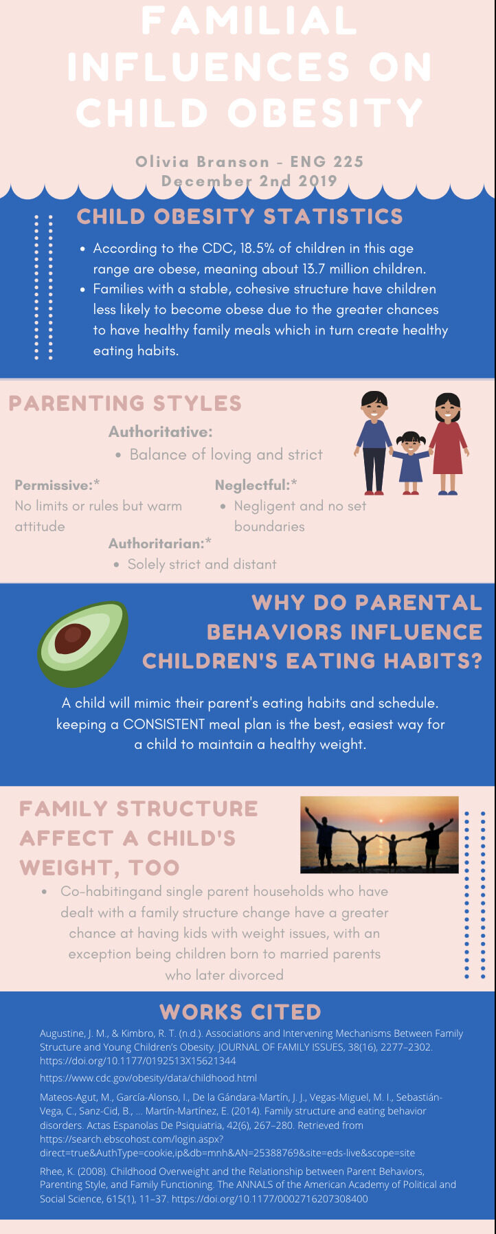
Olivia Branson is a Public Health major and wanted to research a topic interesting to her and important to the field she studied: childhood obesity connected to family situations. This connection between research and visuals in public health would also relate to other infographic studies in professional settings. In many ways, Olivia’s responses represented an investigative glimpse into the transformative processes between traditional research and infographic design. One of the first key issues was how to take the bulk of research from sources and best represent it visually and to an audience. When it came to dealing with larger articles and research, Olivia Branson states that these, “can be kind of difficult to shorten into a sentence or two; when you read through it a couple of times and use the key components you know you want to include, then you can get a better grasp of what you want to put on here [infographic]” (225 interview). In many ways the interview questions and responses represented a “from the ground up” approach when thinking about traditional research practices reinforcing how research design can work.
When reflecting on the infographic platforms themselves, Olivia as well as the other participants often would use their past experiences to reinforce why a certain platform would work. Olivia states of one platform: “Canva is really great in providing a lot of templates that google doesn’t have; like google has 10 or 15 different templates but Canva has so many I can choose from; even has ones that are filled out so that I can get an idea of how my project would look” (Branson, 225 interview). One of the interesting qualities about the stimulated recall responses related to the infographics is that students often are engaged when tweaking, arranging, and organizing pre-existing design elements to rhetorically fit their own research purposes. For example, Olivia’s response reflects an interesting metacognitive response to seeing specific design layouts and realizing that for her topic, “Familial Influences on Childhood Obesity” would have to have a certain appearance that no one single template could provide. This would lead students into a unique composing process where they are given diverse design choices but MUST rhetorically choose what best fits their topic and whether the layout/design can be arranged for the specific audience.
Going off this conversation was a central theme running through the data results which was the attention towards design decisions once a platform was decided on. Next to the personal experiences as a researcher, Olivia like many of her classmates reflected in a detail driven way about their choices. Many of these responses related to design choices reflect many of the critical assessments that are involved with many studies of infographics in classroom curriculum (e.g. Lauer, 2013; MAP, 2013; Wierszewski, 2013). Essentially, when researching infographic design/layout, key features come into play with how students choose to distribute information to certain sections, explain color choices, and work through the presentation style they want. For example, the relationship between color/design choices and key concepts in research (see Fig. 2) is discussed at every stage of the composing process:
I thought the color scheme was for young children, with blue and light pink I think is pretty typical when it comes to young children, you know with gender and everything. And so, I thought it aesthetically pleasing and looked good; the little graphics that they had, the little family on the third slide; google doesn’t really have things like that or even PowerPoint. - Olivia Branson, 225 interview
 |
|
Fig. 2: “Familial influences on child obesity” by Olivia Branson
|
Examining Olivia’s infographic showcases how designing such projects places students in positions as creators and designers of infographics meant to engage specific audiences. First and most noticeable is the attention towards the color and layout, specifically the information and statistics arranged in a descending order. The use of graphics and images is also reflective of the type of public-health-aware infographics that could be seen occupying a doctor’s office space, meant to engage waiting room patients with concise and visually interesting information (Wansink and Robbins, 2016). Students also become aware of the impact of their titles, headings, and overall look of their research information once they engage with an audience as well. Olivia is very “meta” aware of how color and layout of the research infographic can affect the viewer. This reflects a set of composing skills that goes beyond the initial prompt and demonstrates the attention students have between the concepts of their research and how that research would look visually if explained before an audience.
The excitement that these responses provide for future research and developing pedagogy is in thinking about how to better provide resources, instruction, and workshopping for these kinds of projects. For example, Olivia also discussed the technical challenges of projects like this, for instance, the presentation difficulties such as zoom features, and the challenges between the toggle features of edit and present mode (225 interview). Furthermore Olivia states: “I would say that when you’re talking about Canva specifically or different forms of social media where you can create something like this on; you have to adjust to learning how to use it if you don’t have experience with it” (225 interview). Olivia showcases here not only the benefits and affordances of creating research visuals but also demonstrates the need for a research and pedagogical heuristic that instructors can use to understand what kind of curriculum to create (e.g. readings, activities, workshops, tutorials). Furthermore, by creating an infographic with the audience of families/children in mind among public health circles, Olivia strategically chooses design choices appropriate for those she wants to view the visual. Also, as a foreshadow to what her written research paper was like, her infographic fully demonstrates the importance of information transfer which infographics are capable of.
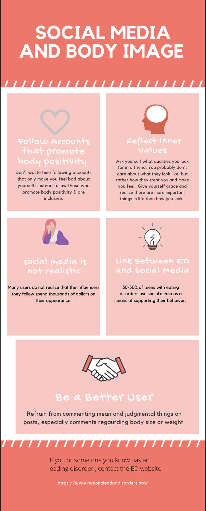
Emily Kahn: Creating Images and Designing the Text
Emily Kahn is a Kinesiology major who also wanted to bring in her specific field of study into research infographics, focusing on social media and body image. She specifically brought fresh insight into how design choices impact the overall presentation of the content. Many of the responses for this interview delved further into the intricate reasons for including certain choices when it came to colors, graphics, icons, and layout. Similar to Olivia though, Emily chose to foreground the “ground-up” approach in starting with their research topics and sources and figuring out how to define using infographics and how this could reinforce the later research paper they would write. For example, Emily Kahn also discusses the theme of concise information transfer and reflects: “you don’t have that much space to put the different info you find so having summarized it into such small portions; that makes it easier to learn” (225 interview). She goes on to state again that the information had to be “presented in a clean and concise way” and that her topic had “overflow of information; I wanted to be clear and concise and to the point” (Khan, 225 interview). In all cases represented, before students engaged with visual/design choices one of the big questions that seems to be on their minds is: What are the main key concepts I need to include in the research infographic? Why should I include some facts and info from some sources and not from others? What is the best way to visually represent my research from the sources, topic, thesis, and argument I have to work with? Emily’s responses reflected these questions but also demonstrated the progression of working between traditional research and adapting it into a visual for an audience.
Emily’s data also provided excellent, and detailed attention towards design elements and the rhetoric of those design choices. Emily showed attention towards color and layout design but also was aware how smaller parts contribute to the whole of the piece. Similar to Olivia, Emily’s project, “Social Media and Body Image,” also asked questions about the role of social media in changing what scholars know about what writing genres are. However, Emily gives a poignant response to how her infographic was designed and the rhetorical messages behind these choices (see Fig. 3):
When I did a lot of the research on social media and body image it was talking about women’s body image specifically so I went with the more pink, red, purple tone based on the research I was getting pertaining to women’s body image… the icons I chose, the heart; that one went with following accounts that promote body positivity and loving yourself and loving your body; another one I used at the bottom was the handshake one that goes along with being a better user; that means leaving respectful comments aside from negative comments on social media. - Emily Kahn, 225 interview
 |
|
Fig. 3: “Social media and body image” by Emily Kahn
|
An analysis of Emily’s infographic also shows a very important attention towards the organization of content based on sections which are organized by icons. As a viewer, the use of the colors and section icons, visually help the transfer of knowledge when moving through the infographic. Notice how the top two icons (heart and mind) specifically concern important values, ethical practices, and positive thinking in online spaces. Next, the icons make connections between eating disorder and reality (person and lightbulb). Lastly, as Emily discusses, the handshake icon helps give the viewer a sense of transaction with what can be learned to improve user experience online. Icons like these greatly increase the viewers reception of textual data and keep the flow of the visual moving. Interestingly, Emily’s responses often connect infographics and social media platforms as networks of communication and information. Emily goes on to say when asked about infographics in marketing/advertising and whether they are useful:
...Especially in today’s age with social media and digitized posters; you see posters around campus with mostly pictures and a few bullet points. As society goes on we will still use infographics but most people when they walk by and see and glance at a flyer or poster, what stands out is the icons, photos, not necessarily the bullet points - Emily Kahn, 225 interview
Lastly, another major theme to think about when students compose infographics is how to address some of the challenges within the assignment prompts and teaching curriculum. As any instructor in writing, graphic design, or other English and Media courses, the question becomes how to address such assignments, assign readings, create resources, and help provide and equip students with what they need to visualize research for themselves and for audiences. Or it can be a mixed learning experience:
...making the infographic was kind of hard for me because I had so much research, but one thing I did like was the ability to be creative; pick and choose what I thought the main points were. Infographics do that, they force you to look at the main points of your research, and I like that because I can be creative and put my own input on what would be most beneficial for the class. - Emily Kahn, 225 interview
Emily, like Olivia, would also point out many of the ways where learning these platforms, how to toggle features, add text boxes, and figuring out where information goes is a major part of the experience. Specifically, as both participants used Canva, they often commented on certain features such as the zoom, presentation, and editing modes; ultimately preferring the editing mode because the content was much larger on screen from one section to the next versus the “sharable” finished product. Of course, the infographic platform itself, whether Canva, Piktochart, Venngage, or Easel-Ly provided technical understanding that involved experimenting and tweaking the content. The following participant also presented an awareness of the technical setbacks as well but also the value of learning these platforms.
Tin Bui: Infographics and Networked Media Connections
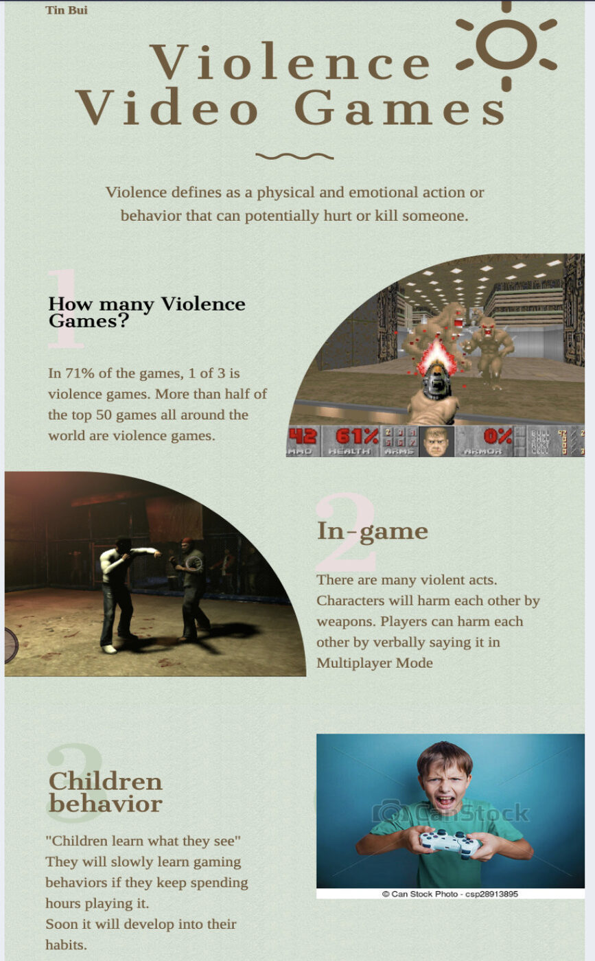
Tin Bui is a Biology major and for this assignment he returned to a previous unit and activity in the course which discussed the role of genres in composition. He specifically chose to think about the negative impact of video games on childhood development. Another viable option for the research infographic and paper outside a field of study or academic major focus, was to select a research topic centered around understanding diverse genres and technologies. Tin responded in a different way than the first two participants as his responses brought in his personal experience of gaming knowledge but also the professional improvements that could be made with these types of assignments. Tin was very reflective of the challenges posed by condensing information within an infographic and thus echoed the theme of conciseness when creating an infographic. Tin Bui talks of this challenge of creating infographics by saying you have “to find accurate information and right pictures because it has to be short and concise” (Bui, 225 interview). Tin Bui also spoke of the historical and personal nature of his research topic: “Violence In Video Games” as his responses reflect his gaming knowledge.
Tin’s visual infographic also represented a unique chronological layout, in a zig-zagging format which helps the viewers comprehension of the layout and reduces the cognitive difficulty of where to start first (Marjooni et al., 2016). For example, in Fig. 4 and 5, Tin researches the effect of video games on young players. Similar in feature to the others, it can be noted that students are both conscious and aware of the patterns and sequences of infographic layouts and compose their information in linear, chronological ways, with major key concepts worked in. Furthermore, students like Tin Bui for example, also are reflective of the positionality of infographics in relation to other mediums of information:
I think this [infographic] is very valuable in terms of pictures and context of it; especially when you look at how newspapers used to be published; newspapers are very hard to reach the audience. They had to go to the store to buy the newspaper; but with technology and infographics we can post it online and to social media like that and it can be short and concise and have a high accuracy of what is established - Tin Bui, 225 interview
|
|
|
Figs. 4 and 5: “Violence [in] video games” by Tin Bui
|

While the challenges can be related to learning the technical features of infographic sites (such as PiktoChart, Canva, Easel-Ly, Venngage among others), or thinking about what content to include and leave out, sometimes learning a new platform or digital tool presents its own rhetorical and pedagogical questions. Another interesting suggestion for projects like these came from Tin Bui who suggested another unique way of presenting this material: “people can stand up and walk around in a workshop and come around and look at each other’s’ work which would be more engaging and a great way to pay attention when looking at infographics” (225 interview). In other words, instructors should make the decision early on whether to use infographics in presentation style settings or as virtual workshops or convention spaces. Tin’s responses, while reflecting on his own design decisions, often branched out to ways of better understanding how presentations methods could increase engagement with these visuals.
Toward Infographic Pedagogy: Text, Image and Data
The data I collected with Olivia, Emily, and Tin’s student responses and infographics places emphasis on how design elements are reflective of navigating between two types of information presentation: the written research and the visualization of that information. There are three primary outcomes with using infographics that are important for instructors to consider:
- Infographics can act as a visual alternative to traditional written outlining, brainstorming and mind-mapping. By creating these, students can have a better visual understanding of how to write and organize more effective written papers based on their topics/headings. This can be an extremely productive pre-writing aid.
- Infographics can train students in professional and business communication contexts; by using a visual during presentation time, students can become more proficient at public speaking using an infographic to develop conversation with an audience.
- Infographics can help students explore new modes of composing and develop skills valuable within graphic design, public policy, health, and other professional careers.
In my study, Olivia, Emily, and Tin clearly demonstrate the importance of how infographics can be useful in both academic and non-academic contexts. They are valuable examples of how infographic composing is a major part of thinking about research practices related to visual rhetoric, graphic design, and using digital tools. There is an intricate relationship between text and image that researchers, students, and instructors have when navigating how different modes adapt and change in the composing process. It is important to also note the hierarchy of elements when it comes to design rhetorics as audience, purpose, and context still play a crucial role just as with traditional research projects.
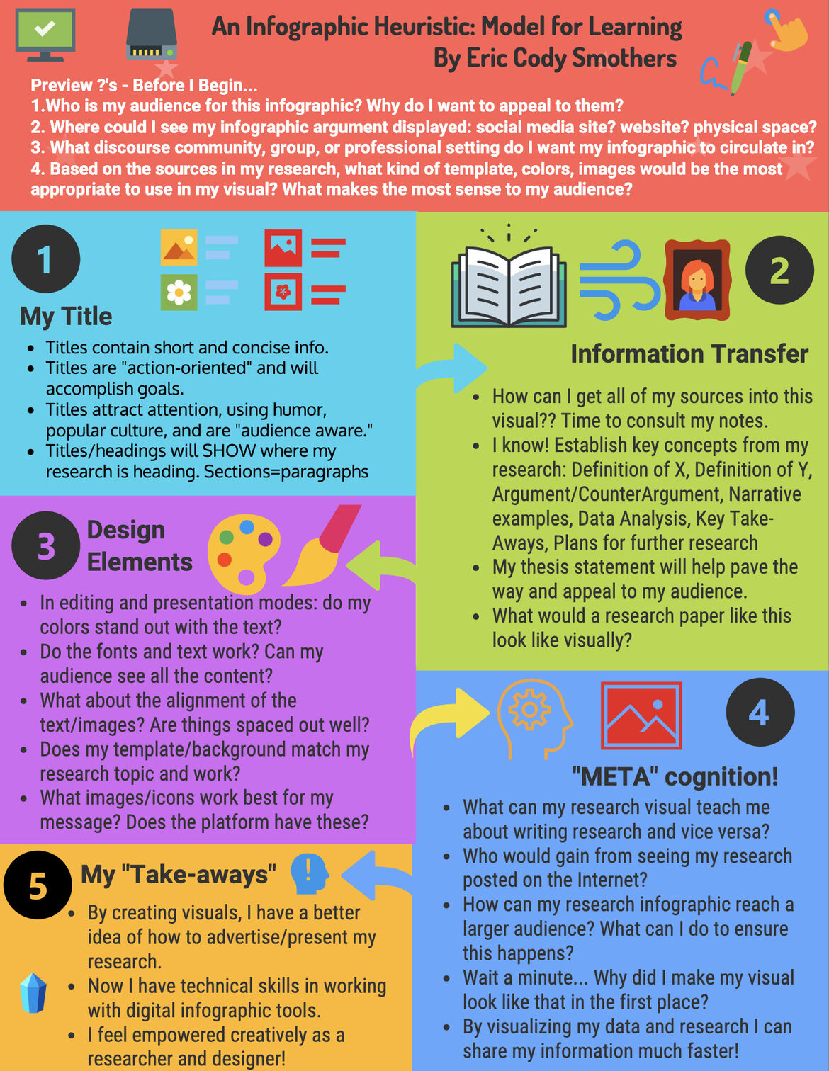
Using the research here and students’ responses, I propose a new model heuristic (see Fig. 6) based on this study so that instructors can have a way of understanding the cognitive questions and functions of student infographic projects. A full link is also provided in the figure description. This heuristic model infographic is meant to act as a tutorial demonstration for students who want to have a set of criteria and factors to consider when making an infographic. Instructors can also apply this heuristic model to their own teaching practices and evaluation methods when it comes to student products. Furthermore, instructors can ask students what specific areas of this heuristic they are most concerned about or want to concentrate the most on for grading purposes (also see Appendix A resource). In considering my own audience for this infographic, I designed it specifically for both teachers and students in mind as we all continue learning together when embracing digital composing tools. Also, by organizing the infographic in specific categories, both students and instructors can navigate each section to determine whether enough textual and visual content is included in the final product. Instructors and scholars who help students compose visually with design rhetorics move one step forward into truly dynamic pedagogical and professional practices that will benefit all.
 |
|
Fig. 6: “An infographic heuristic: Model for learning”
|
|
Also for Accessibility Options, go to: https://infograph.venngage.com/ps/gYyIESHYkKY/eric-codysmothers
|
Appendix A: Interview Questions and Infographic Pointers
Appendix B: Visual Journey Reserve: https://prezi.com/m-wwzqvij_lq/visual-design-in-research-and-ads/ or https://slides.com/codys/deck-83cf00
References
Branson, O. (2019). Familial influences on child obesity [infographic] & 225 interview responses. Canva, https://www.canva.com/design/DADs3vEVihk/hhk6f-mV11rvjgM1oV6NpA/view?utm_content=DADs3vEVihk&utm_campaign=designshare&utm_medium=link&utm_source=publishsharelink
Bui, T. (2019). Violence [in] video games & 225 interview responses.
Graham, S.S., & Whalen, B. (2008). Mode, medium, and genre: A case study of decisions and new-media design. Journal of Business and Technical Communication, 22 (1). 65-91. https://doi.org/10.1177/1050651907307709
Kahn, E. (2019). Social media and body image & 225 interview responses. https://www.canva.com/design/DADrjqtReKM/4pFSpAJEbO0F7I8VBWWHFg/edit
Lauer, C. (2013). Examining the effect of reflective assessment on the quality of visual design assignments in the technical writing classroom. Technical Communication Quarterly, 22(2), 172–190. https://doiorg.proxy.lib.miamioh.edu/10.1080/10572252.2013.757156
Majooni, A., Masood, M., & Akhavan, A. (2018). An eye-tracking study on the effect of infographic structures on viewer’s comprehension and cognitive load. Information Visualization, 17(3), 257–266. https://doi.org/10.1177/1473871617701971
Mauldin, S. K. C. (2015). Data visualizations and infographics. Rowman & Littlefield.
Multimodal Assessment Project Group, MAP. (2013). Developing domains for multimodal writing assessment: The language of evaluation, the language of instruction. In Heidi A. McKee & Danielle Nicolle DeVoss (Eds.), Digital Writing assessment and evaluation. Computers and Composition Digital Press/Utah State University Press. https://ccdigitalpress.org/book/dwae/07_nwp.html
Ozdamli, F., & Ozdal, H. (2018). Developing an instructional design for the design of infographics and the evaluation of infographic usage in teaching based on teacher and student opinions. Eurasia Journal of Mathematics, Science & Technology Education, 14(4), 1197–1219. https://doi.org/10.29333/ejmste/81868
Rosenberg, K. (2011). Reading games: Strategies for reading scholarly sources. In Charles Lowe and Pavel Zemliansky’s (Eds.), Writing spaces: Readings on writing, 2. Parlor Press. https://writingspaces.org/?page_id=267
Sorapure, M. (2019). Text, image, data, interaction: Understanding information visualization. Computers and Composition, 54. https://doi.org/10.1016/j.compcom.2019.102519
Stedman, K. (2011). Annoying ways people use sources. In Charles Lowe and Pavel Zemliansky’s (Eds.), Writing spaces: Readings on writing, 2. Parlor press. https://writingspaces.org/?page_id=267
Wansink, B., & Robbins, R. (November 2016). Which design components of nutrition infographics make them memorable and compelling? American Journal of Health Behavior, 40(6), 779–787. https://doi-org.proxy.lib.miamioh.edu/10.5993/AJHB.40.6.10
Wierszewski, E. (2013). Something old, something new: Evaluative criteria in teachers’ responses to student multimodal texts. In Heidi A. McKee & Danielle Nicole DeVoss (Eds.), Digital writing assessment and evaluation. Computers and Composition Digital Press/Utah State University Press. (DWAAE). https://ccdigitalpress.org/book/dwae/05_wierszewski.html
Williams, R. (2004). The non-designers design book: Design and typographic principles for the visual novice (2nd ed). Peachpit Press.